I'm still in the middle of this (long overdue) personal rebranding process. My hope is that this project will become a whiteboard of sorts so that as things are gradually updated and refined I can showcase and get feedback on them here.
My goals with this project are to sharpen and showcase my skills by practicing on my own personal brand. This should all culminate in a style guide and/or design system that will inform the revamp of my personal website.
Photo
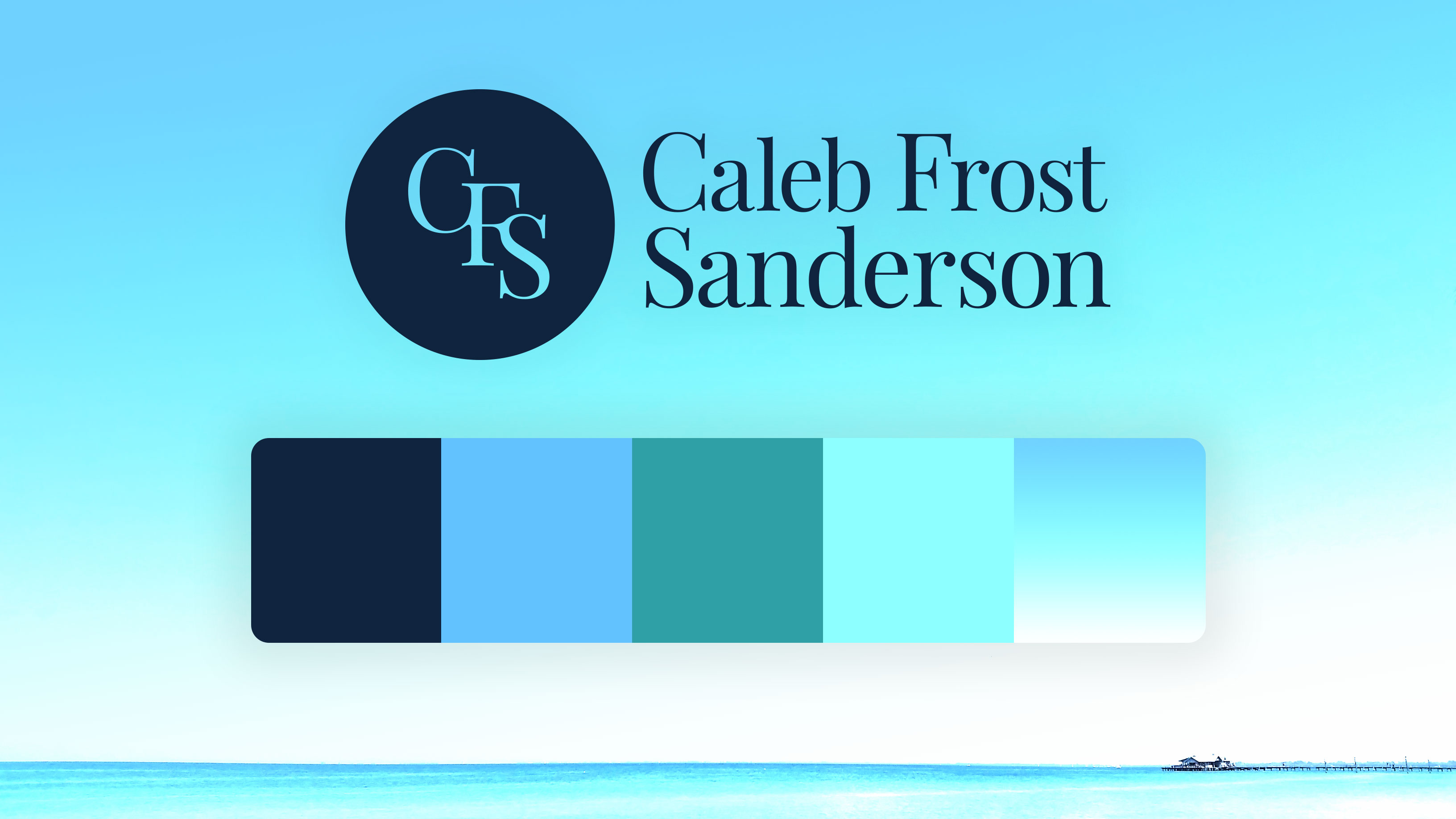
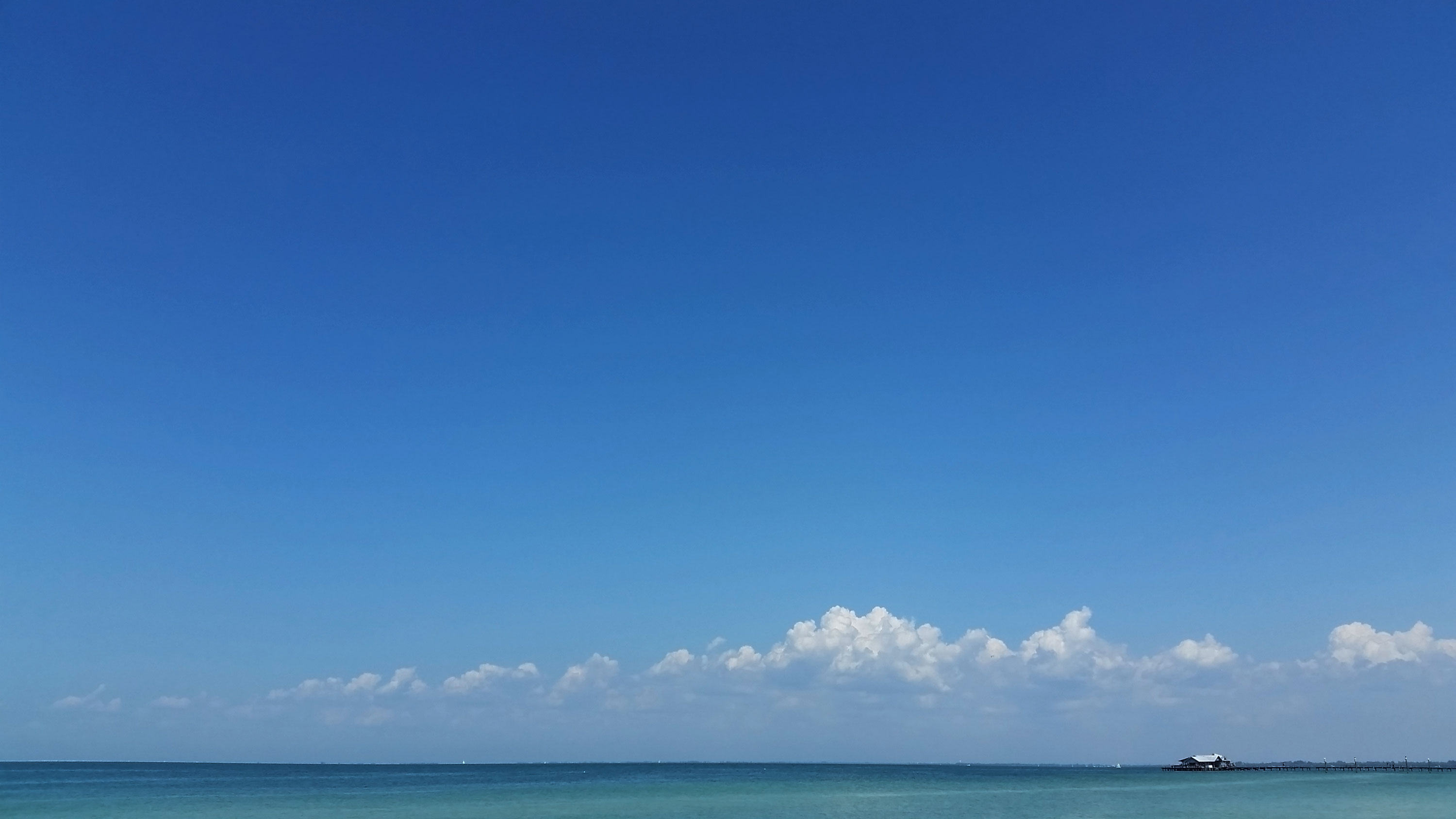
The main photo used in these mood boards is of the city pier on Anna Maria Island. It was taken several years ago on a perfect summer day at our favorite beach. I've used for a long time with my personal content but it did receive some new treatment. You may think over-exposed pictures of Florida beaches are cliche, and you'd probably be right, but I love it. It was taken on an old Android cell phone and is tied to some very sweet memories for me personally.
Colors
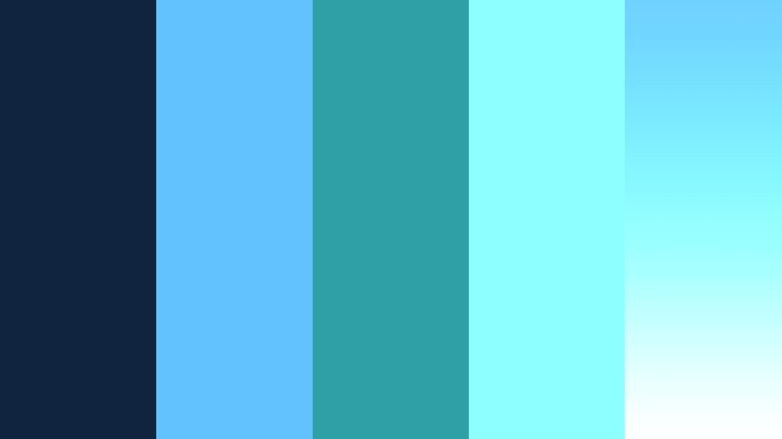
Is the internet slowly becoming a blue soup? Maybe. I thought long and hard about the color palette and after months of futzing around with warm earth tones just so I could be unique, I took a long hard look at what I actually like to USE on a regular basis and decided to embrace the blue.
"Embrace the blue" has been my motto with this project.
To me, blue is trustworthy, peaceful, cool in temperature, and works well with dark modes (which is a stretch goal for my personal site). Navy and teal - you can't go wrong with that.
Logo, Wordmark, and Lockup
My goals for the logo were to keep it flat and one-dimensional so that it would work well in print or digital at any size and with any of my branded color combinations. Both the letters in the logo and the wordmark are based on the primary header font, Playfair Display (more on font choice later).
For the wordmark I started with a regular weight Playfair Display and then made minor visual adjustments to the kerning. The beginning letter in each of my names is also enlarged slightly from stock Playfair.
Once I had the logo and wordmark straightened out, the lockup was much easier. My first and middle names are slightly smaller in the lockup to align visually with my longer last name.
I realize that this treatment is not exactly flashy and I'm OK with that. I value economy, efficiency, and consistency and I believe this reflects that. In a day when everyone has to have a logo to feel successful in the world, I would rather win attention by building trust through consistency.
![]()
Typography
I love serif fonts and Bodoni is a particular favorite. For me it brings to mind musical and movie titles from the 60's. I actually prefer using a combo of sans-serif headings with serif body copy for most projects if possible. That is usually based on the argument that serif fonts are easier to read and a nice blocky sans-serif is easier to manage visually for large headings.
One of the requirements (restrictions) I gave this project was to rely on free, open-source fonts (thanks Google). Since Bodoni is not free, I chose Playfair Display because it is (in my opinion) the best Bodoni-esque typeface available. For body copy I chose Open Sans because of it's upright stress and excellent legibility.
Here are some interactive moodboards that are built with Figma so you can see how some of these elements might work together.
Thanks for stopping by. There is more to come so check back often and if you have questions or comments about what you see hear, feel free to contact me